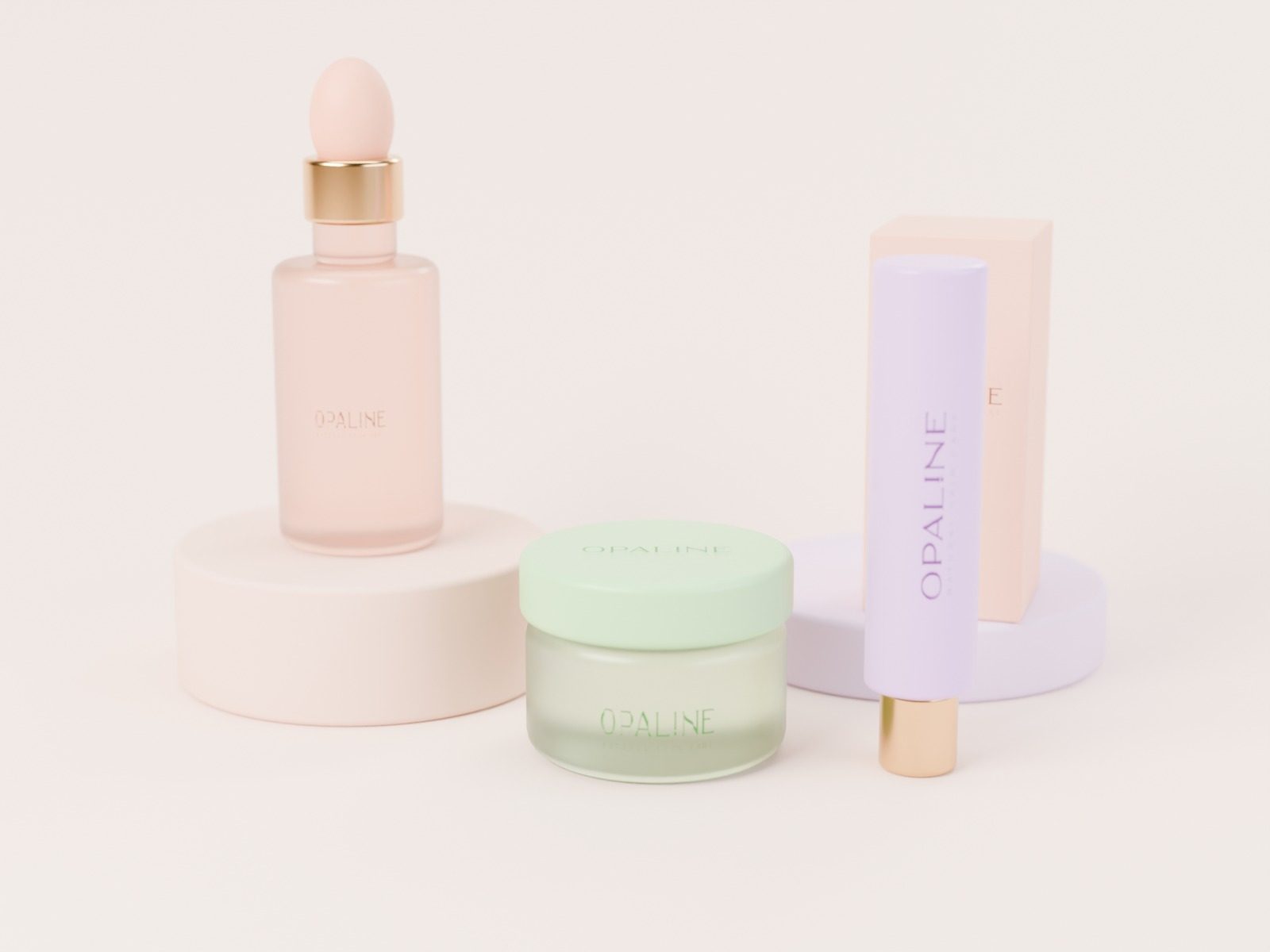
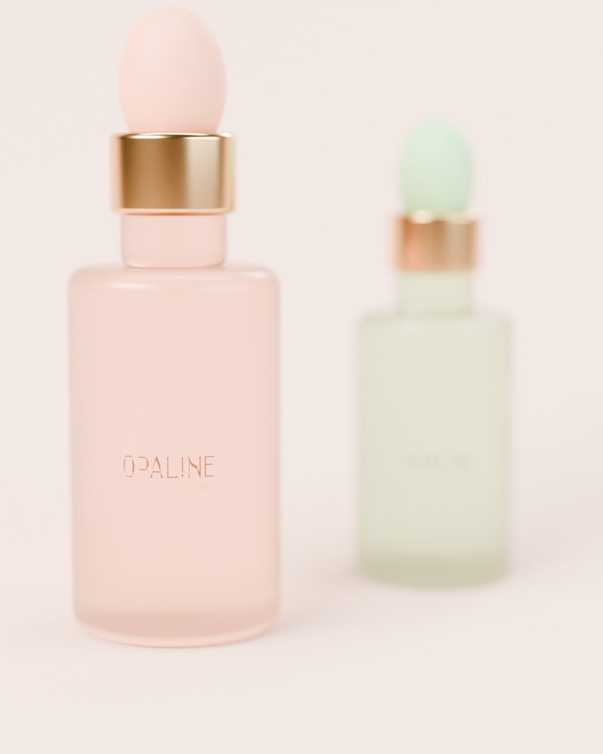
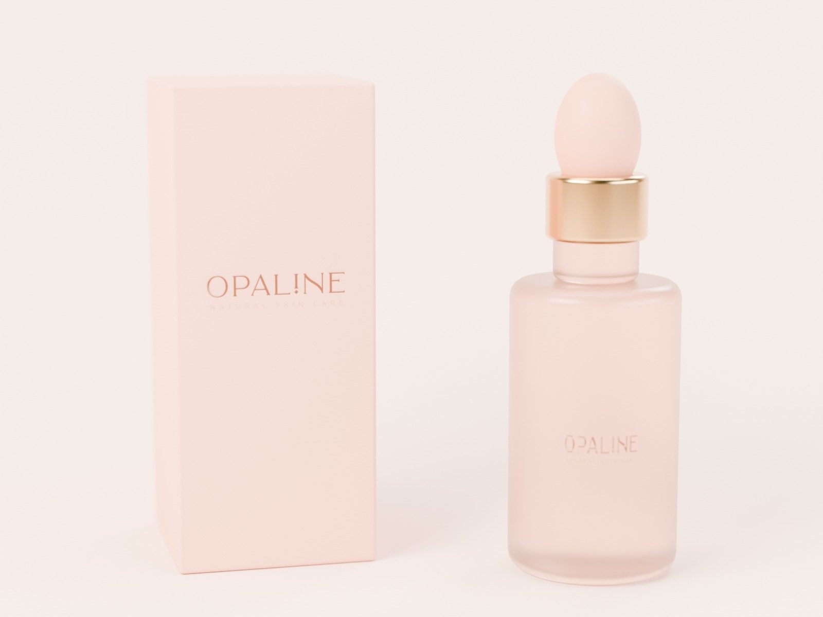
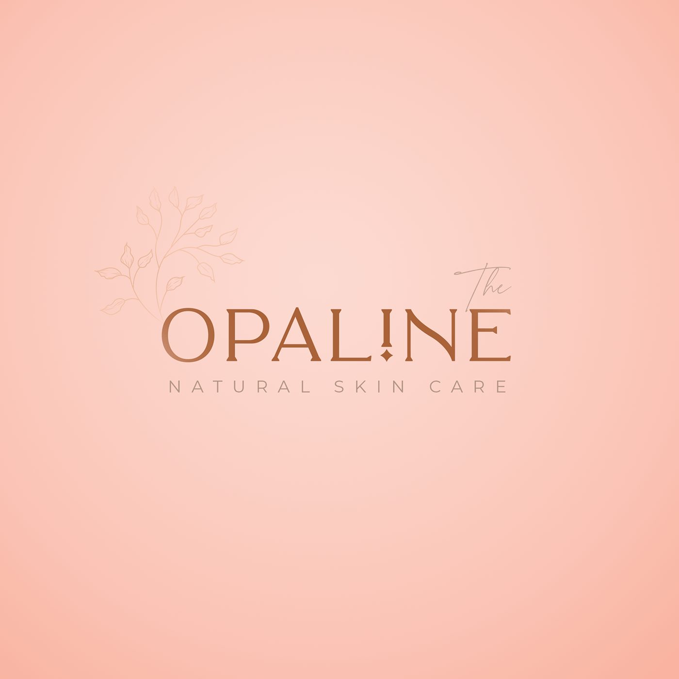
Opaline is a natural skin care brand. Its identity is a light serif wordmark with an i dotted like a drop of serum, a hand-drawn sprig of leaves and soft pastel shades, one for each line.
Opaline skin, softly.
- Project
- The Opaline
- Field
- Beauty · Skin care
- Services
- Logo · Brand identity · Packaging
The mark
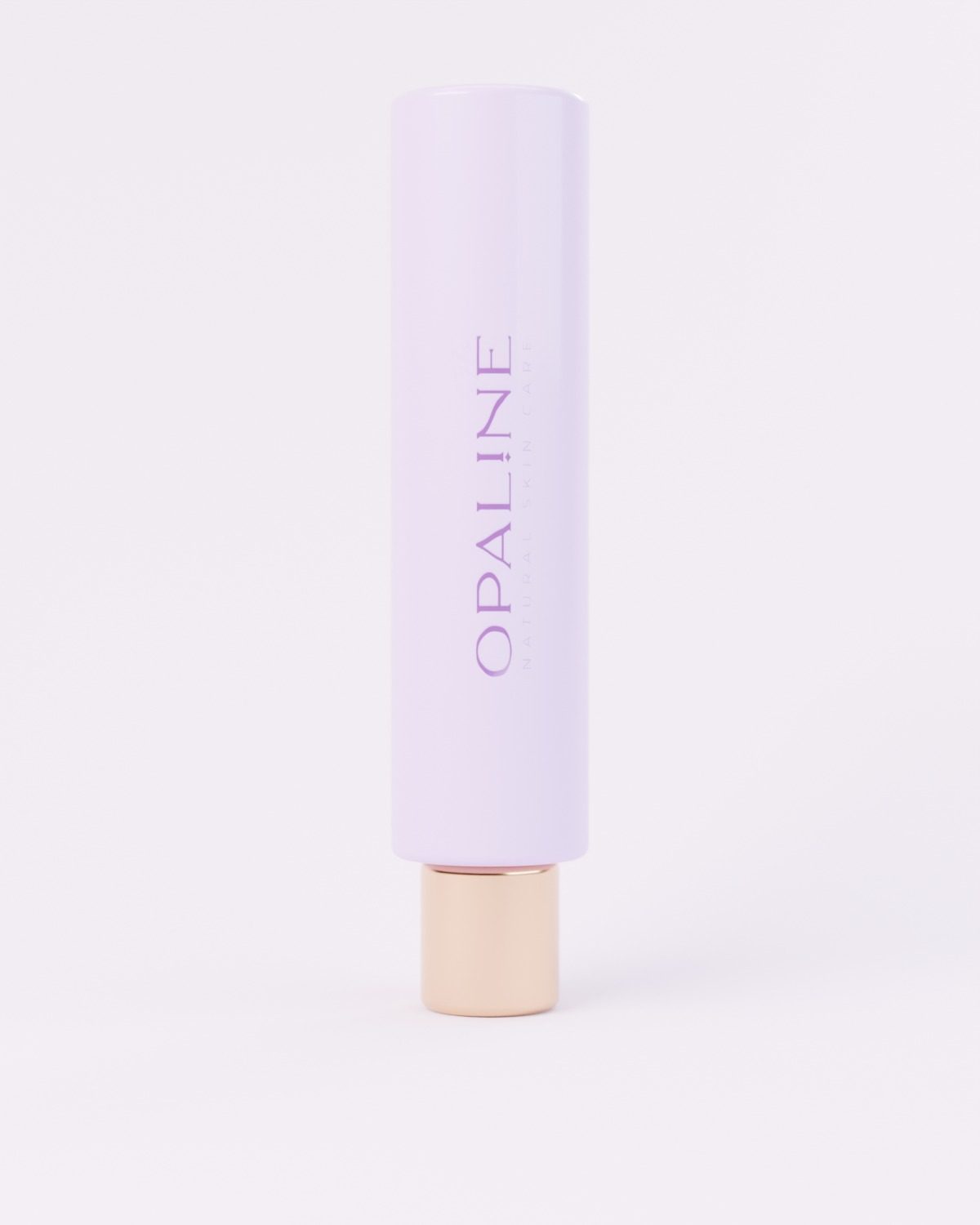
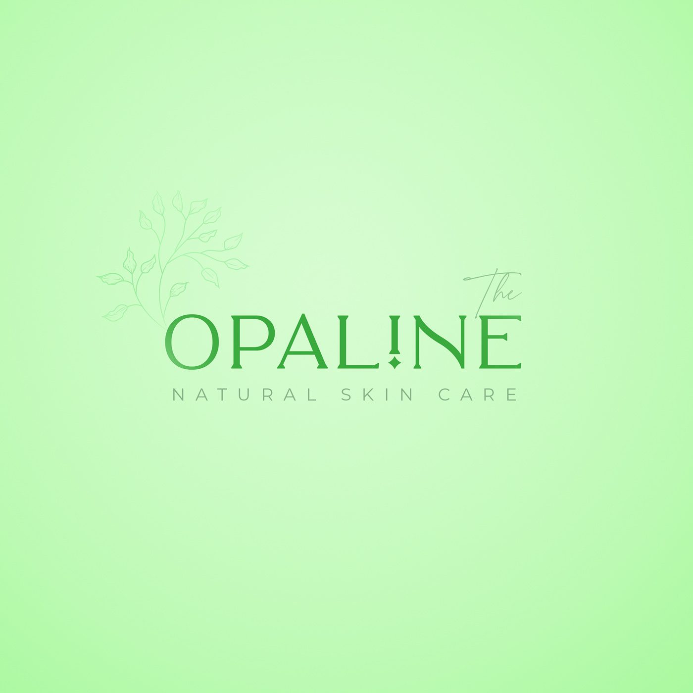
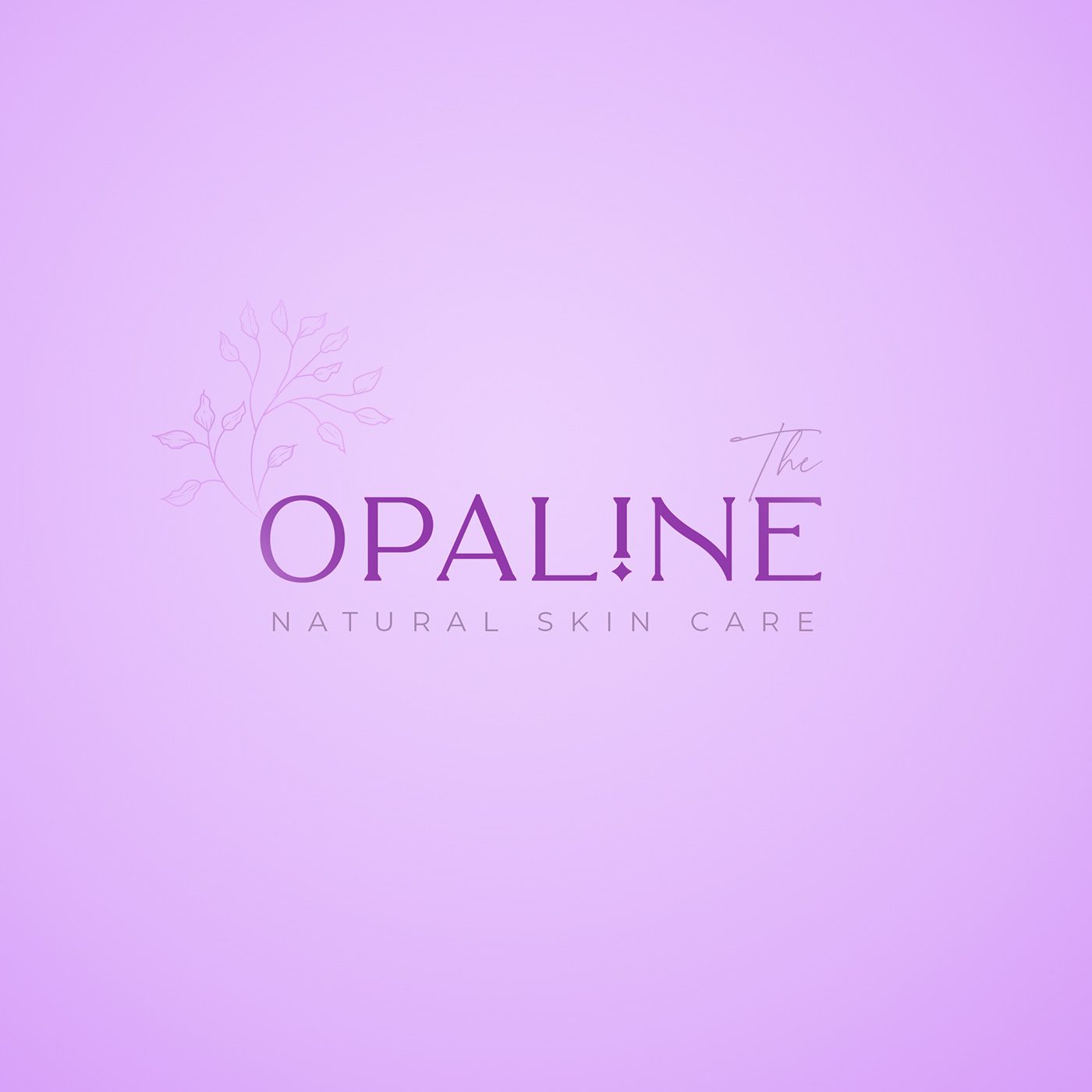
One wordmark in three shades, peach, mint and lilac, so each range has its own colour and the same calm voice.
On the shelf
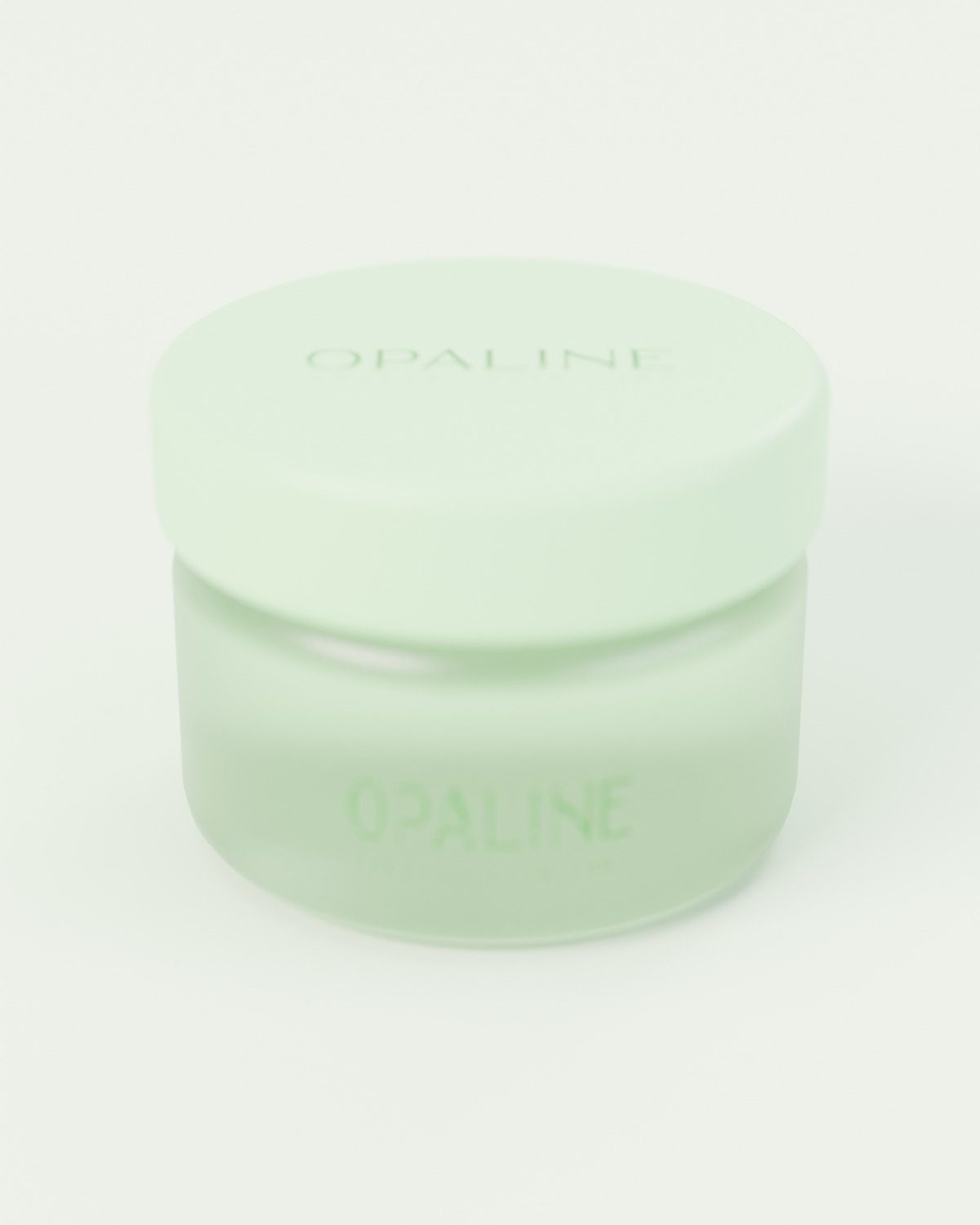
Frosted glass, soft caps and quiet type: the packaging lets the colour do the talking.